
 In the web world, being responsive has become a norm. It’s considered uncool if you don’t have your website mobile- or tablet-friendly. As much as we have been trying to make our eLearning courses responsive, we have been facing a lot of challenges all these years. The main challenge is that an eLearning course is not like a big long web page that you need to make responsive. In eLearning courses, you are dealing with screen/slide based approach, which are essentially of fixed width and height. Also, the elements in an eLearning course are more complex than a web page. A web page carries text and images, and sometimes audio, video, and animations. But an eLearning course has a timeline-based approach, with objects appearing/disappearing based on timing or click of a button. There are interactive objects, overlay objects, embedded content, assessment questions, simulations, and playbar, besides the other media elements.
Attempts have been made to create responsive eLearning courses but it called for a completely different authoring strategy and a lot of coding, which is very different from the normal eLearning course creation process. This required the authors to get trained on some new tools and technologies.
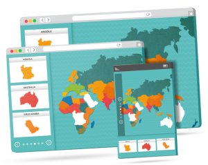
 Adobe Captivate 8 has tried to simplify this process for eLearning authors and allow them to create responsive courses using the same authoring tool with the same set of options and absolutely no coding required. To meet the eLearning look-and-feel requirement and make it simpler for the authors, you will find three breakpoints for Primary, Tablet, and Mobile layout. Here’s the default width and height for the three breakpoints:
Primary view: 1024×627 pixels
Tablet view: 768×627 pixels
Mobile view: 360×415 pixels
You can change the default size easily by moving the width and height sliders. One important thing to note here is that in responsive projects, only width is responsive and height remains static to give the same slide-based paradigm and give more control to the author.
To make it simpler for the authors, Adobe Captivate comes with pre-built responsive themes which allows them to lay out the content well on all the breakpoints without much efforts.
The authors need to design the content on Primary screen as they always have, and then tweak the content for the tablet and mobile layouts with the help of various size and position options. Also, when objects are added in a responsive project, they automatically takes a percentage-based size and position and resize themselves in different layouts. Of course, this can be changed to pixel-based size and position, along with other options that allow you to keep the overlay objects intact and move the related objects on the screen together.
Based on the device width and height, you can also exclude objects from some of the views to show just the important objects in the small size devices and use the space judiciously. There is also a possibility to assign a minimum or maximum size for an object so that it doesn’t become extra-large or extra-small on different devices. This comes in really handy when you are including branding imagery in your course which cannot be smaller/bigger than a particular size. You can also have a completely different look and feel for each device size.
There can be different text for each breakpoint along with different formatting for the text. The text can also be made fluid which reflows on different screen sizes instead of being truncated.
Previewing a project is a very important task while creating an eLearning course, and Captivate provides various options to preview the responsive content well. You can check the placement of the objects in different layouts in the edit area by switching to different breakpoints. You can preview the course in a browser, which comes with three different tabs to allow you to see the content. It also comes with a slider, which allows you to check how content is looking in between breakpoints. Adobe Captivate also has a preview option in Edge Inspect, to help you preview your courses directly on devices.
These responsive courses are gesture-enabled and you can easily use the swipe, tap, and pinch options to navigate through the courses.
Also, to take the mobile learning experience a step further, Adobe Captivate comes with variables to use the GPS-capabilities and device type to deliver location-aware and device-specific learning experience. Providing training based on the location of the learner can be really helpful for employee induction training, disaster recovery, health care options based on location, travel-related information, single training for global audience, etc.
Adobe Captivate is the first tool that allows you to create true responsive courses and has opened a world of opportunities to explore the mobile learning arena!
Happy captivating! 🙂