Adobe Captivate 2017 comes with an exciting new workflow to aid in the creation of responsive eLearning courses: Fluid Boxes. Instead of designing multiple slides for different screen sizes (known as breakpoints), you work on a single slide. Fluid Boxes, containers that you insert on the stage and then populate with content, improve the responsive development time significantly.
Let’s take a look at the steps to record a responsive simulation with Captivate 2017:
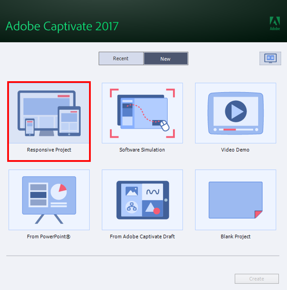
To begin, start Captivate 2017 and double-click the Responsive Project thumbnail on the New tab of the Home screen.
A new, responsive project is created. Unlike Captivate 8 and 9 responsive projects, there are no breakpoints. Instead, you will see the Preview-in drop down list and the Preview Slider, to view how the content will be displayed on different device sizes, right inside the Captivate edit area.
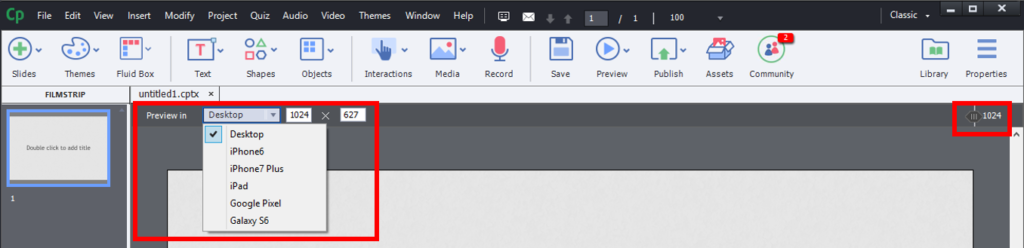 Notice that the default maximum width and height of responsive projects in Captivate 2017 is set to 1024 x 627. You can increase or decrease it by rescaling the project.
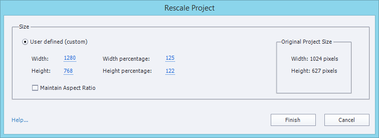
To rescale the project, click Modify > Rescale Project.
In the Rescale Project dialog, enter the new width and height in pixels or percentage, and click Finish.
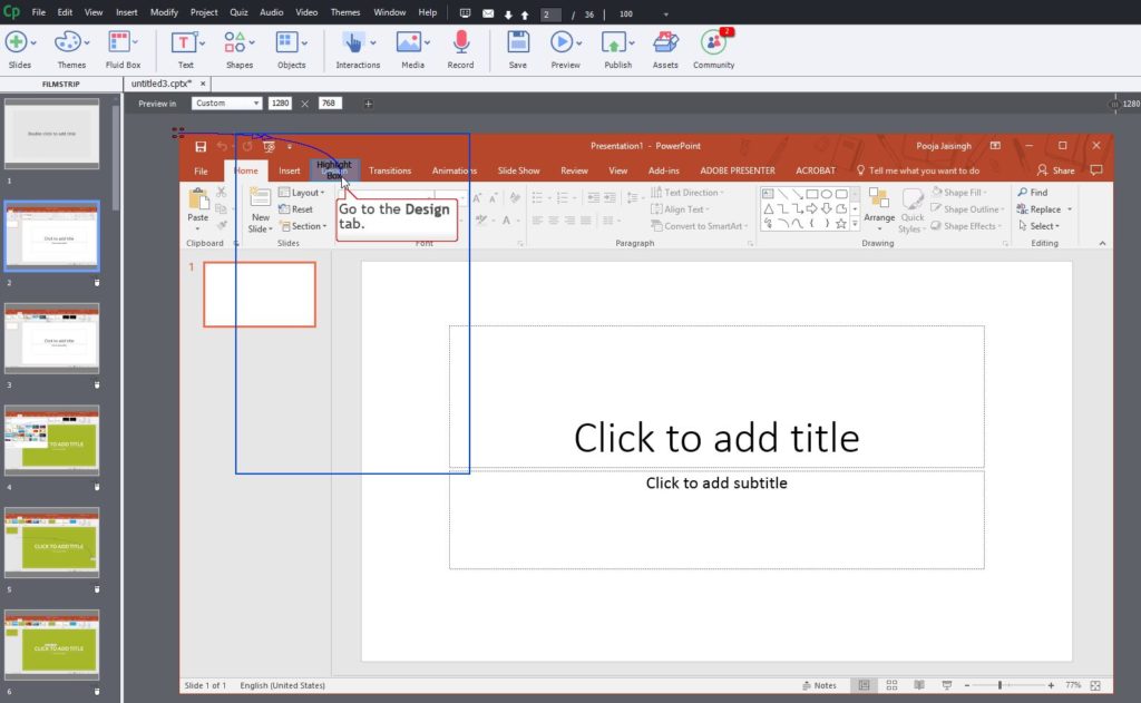
 Now let’s record the simulation. Go to the Toolbar and click Slides > Software Simulation (Click OK to confirm addition of slides after the selected slide.)
Select the window you wish to record, click the Record button, and then record the simulation (press the End key on your keyboard to finish recording).
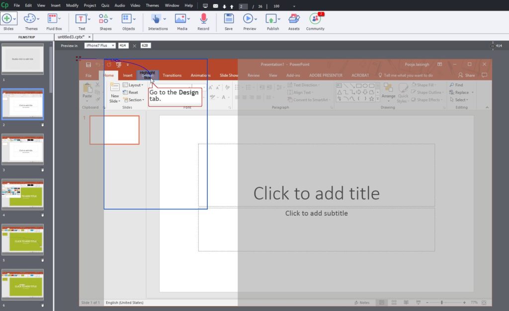
The recorded slides are added to the Captivate project. Notice that there’s a blue rectangle on each of the simulation slides. The blue rectangle is the focus area of the simulation. It’s only visible in the edit area, and will disappear when you preview or publish the project. Note that the size of this blue rectangle is the minimum supported device size for Captivate responsive projects.
 You can reposition this blue rectangle to any other location and you’ll want to ensure that the rectangle covers the click area in the simulation.
To preview the slide in different device sizes, select the device options from the Preview-in drop-down menu. Notice that the visible area is always surrounding the blue rectangle and the rest of the area is greyed out.
 To preview the entire project, choose Preview > Project. You can move the slider to check the responsiveness of your simulation.
When you publish and deploy the responsive simulation course to an LMS or web server and view it on a mobile phone or tablet, you will be able to pan to the areas which are not shown in the simulation. And as a result of this special panning functionality in responsive simulations, the default Swipe Right, Left, Up, or Down gestures are disabled for all the responsive simulation slides.
Want to learn more about the new features and enhancements in Adobe Captivate 2017? Check out my Captivate 2017: First look course on Lynda.com and LinkedIn Learning.
This post was first published in IconLogic blog.